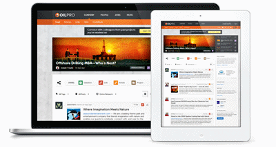
Responsive web design is a web development method that creates the best viewing experience no matter what device is being used - laptop, desktop, tablet, or mobile phone. Websites with responsive web design use fluid grids to automatically adapt for resolution and image size.
ComputerWorld reports that more people in the United States will access the Internet via mobile devices than through desktop computers or other wired devices by 2015. Bloggers, business owners, and web developers who recognize this trend should create web pages that are easily viewed on multiple devices, making it easier for readers to view the sites on the device of their preference.
When you create a website that is responsive, it allows you to create only one site, rather than creating a separate site for mobile users. When maintaining your site and updating information, it makes sense to only manage one set of pages.
Also, when you develop a responsive website, you eliminate the need for a separate mobile app. This will keep more money in your pockets since you don't have to hire a developer to write a mobile app.
Here are 10 inspiring blogs that use responsive web design:
- Looking to ramp up your web design and development? CSS-Tricks offers demos, forums, and a members-only area with video tutorials. The site is loaded with information, yet it’s easy to navigate on any device.
- The Theme Foundry designs and sells WordPress templates for use on your own website. If designing a website isn’t one of your favorite things to do, take a look at the themes available for purchase. The templates allow you to spend your time writing great content and running your business.
- Tattly is a temporary tattoo store for design-minded kids and kids-at-heart. Tattlys are designed by professional artists and printed in the United States. The responsive design makes it easy to shop wherever you are.
- Oilpro is an online community of oil and gas professionals. Users create online profiles, then connect with current and former colleagues, companies, and projects. The clean and crisp design makes navigation a breeze, no matter which device the reader uses to access the website.Photo credit: Oilpro
- These Are Things is an illustration studio and paper goods brand headquartered in Brooklyn, New York. The owners craft modern cartographic goods, draw informational illustrations, and write about the business of art. The website's graphics and illustrations are simple yet inspiring, and are easily viewable on any device.
- Karma is a pay-as-you-go pocket-sized WiFi hotspot. Users can earn additional data by sharing the WiFi signal with new users. The redefined dashboard allows you to check your usage and other account information - the responsive design makes this task easy on any device.
- Web Designer Wall is the website for Toronto-based web designer and illustrator Nick La. His eye-catching site discusses design ideas and trends, and offers web design tutorials.
- WritingZone provides customers with technical documentation services, such as user guides, training materials, and corporate profiles. The site's simple navigation allows the user to access information quickly on any device. The blog highlights technical writing tips, many of which can be applied to other projects.
- Tech.Pro is a community for technology professionals interested in connecting with peers, advancing their skills, building credibility around their expertise, and exploring exciting new opportunities. The site offers helpful information for developers and offers a place for professionals to ask questions and seek advice from their peers.
If you are planning to update your website soon, or if you will be developing a new site, consider making it responsive. Readers will access your site from different devices depending on their schedule. Perhaps they are sitting in a waiting room at a doctor's office, or maybe waiting in a carpool line. Readers may get frustrated if your site is difficult to read, and may end up taking your site off their reading list.
As you develop your new responsive website, you'll probably want to test it to see how it looks on different devices. Here are several online tools you can use:
The increase in sales of tablets and mobile phones means more people will access the internet while on the go. If you want people to visit your website, and return in the future, you need to have a website that automatically adjusts to the user's device.


